Beginning a system is first a matter of grasping what the essence of what your subject is—Folk Art to me is all about the local, personal, quality of the art.
Because folk art is global in scope, varied in style, and takes on a local, personal, and individual quality, I felt that an iterative logo with a series of permutated Fs is effective at bringing those qualities into the visual language of the system.
This series can also change with the demands of the museum, adding new F’s whenever the museum demands it.
In a poster context, The F iterations stacked on top of one another creates an abstract wash of form—and communicates the wide scope and breadth of what 'Folk' entails at a single glance.
An application of this iterative F system is in desk name plates—these different F’s can be customized and swapped out to demarcate different sections of the museum.The radial halftone alludes to the sonic travel of sound, and emphasizes the volume of the performance.
—
—
Translating the identity to a web environment was firstly a matter of how content would be organized, so I again used the logo at supergraphic scale to dictate where those gridlines would be, what the edges of that content would click to.
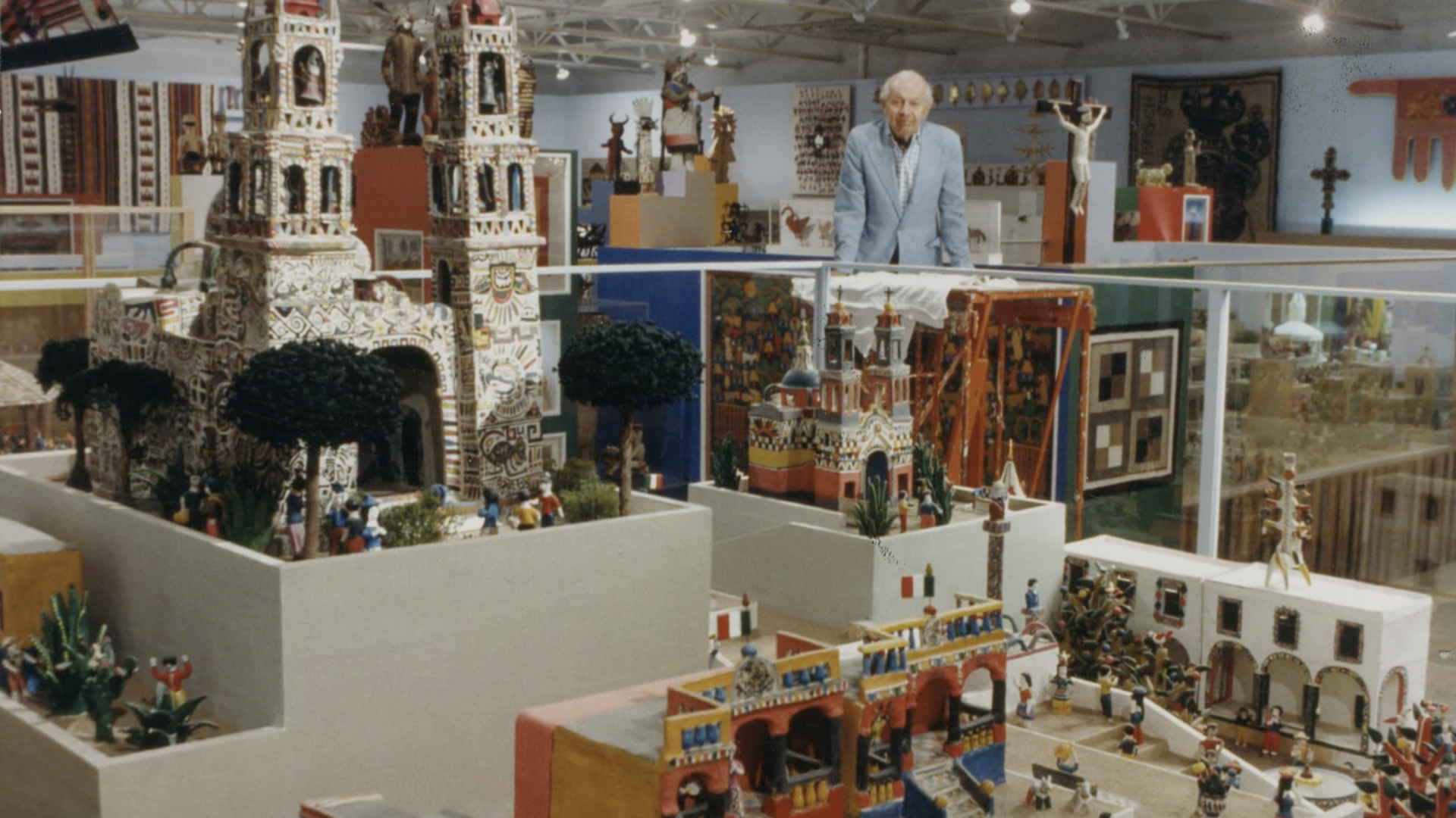
That same big, bold, dynamic typography is used as a way to introduce things, in this case the founder of the museum.
—
—
As a component of this project, MIFA acts in collaboration with the National Hollerin Contest, for an interactive wall installation showcasing the lost vocal tradition throughout the years.